
In this guide
- Build the image plan from the actual packaging
- Make the label readable before adding atmosphere
- Show texture in a way that answers a question
- Use ingredient props carefully
- Build a routine scene around a real action
- A sample image plan for a fictional moisturiser
- Keep AI-assisted visuals anchored to the sample
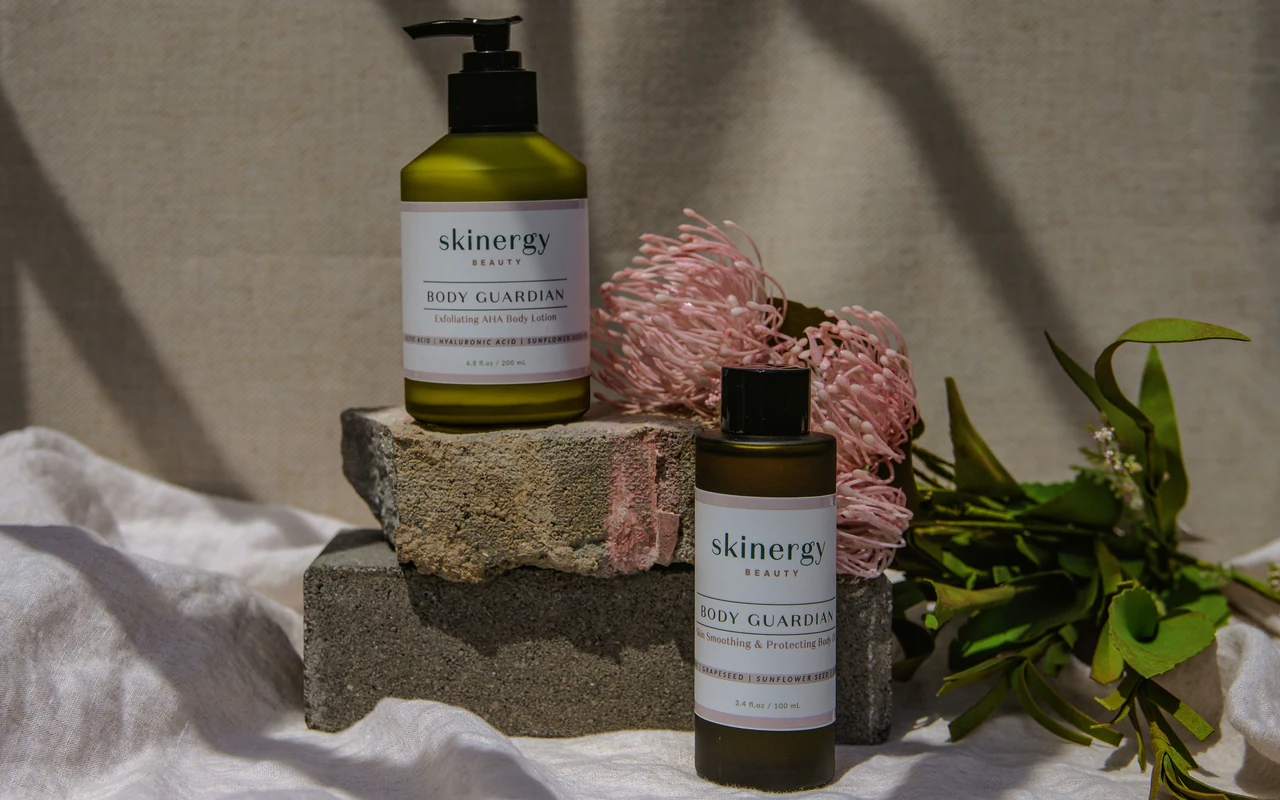
A skincare bottle can look luxurious and still tell a shopper very little. Soft shadows, water droplets and a stone pedestal create a mood, but they do not explain the closure, the amount in the bottle or the texture someone will put on their skin. A strong image set makes room for both presentation and practical detail.
Skincare product photography is particularly sensitive to small changes. A warmer colour grade can alter the appearance of a serum. A generated cap can look more expensive than the actual packaging. A prop ingredient can suggest something about the formula. The photographs need to stay tied to the product, even when the styling is expressive.
Build the image plan from the actual packaging
Start with the exact sample that customers will receive. Check the front label, back label, closure, carton and fill quantity. If the photography sample has a temporary sticker or a prototype pump, resolve that before designing the images.
Make a packaging fact sheet. Record the product name, variation, container size, closure type and included components. Keep approved descriptive wording in a separate section. This avoids the common situation where attractive copy is written first and someone later discovers that the package cannot support it.
Photograph the container and carton separately, then together if both are part of the offer. A clear view of the back label can be useful reference material even when it is not selected for the final gallery. It gives the creative team a source of truth for later checks.
Make the label readable before adding atmosphere
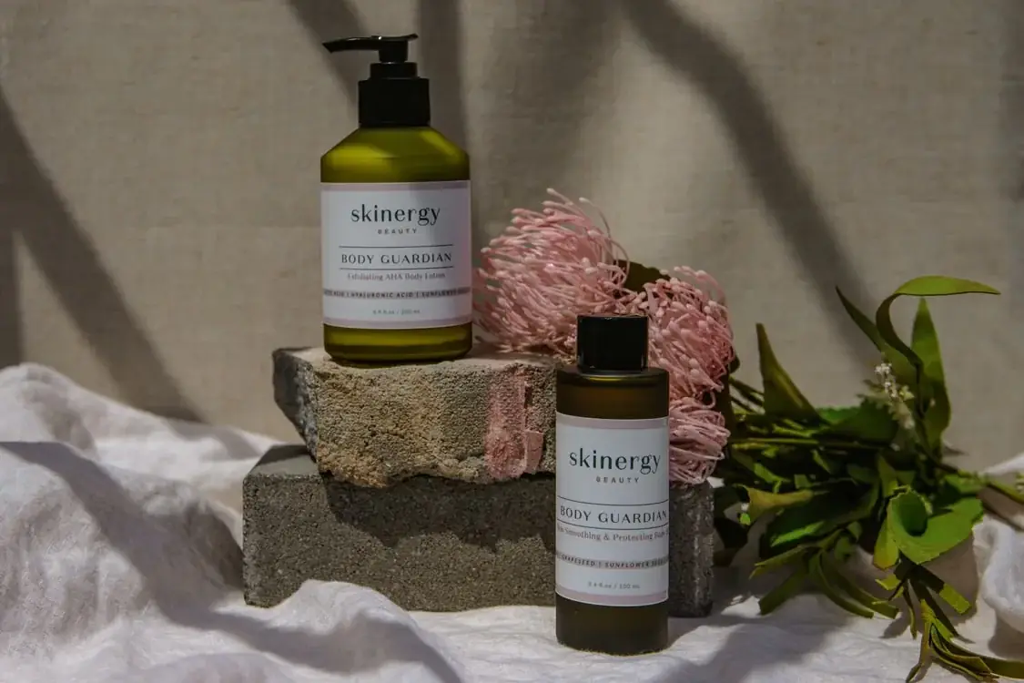
Turn the bottle until the front label is legible and the container still has shape. A reflection down the middle of the text is usually more damaging than a less dramatic highlight near the side. Move the light, camera or product in small steps until you find a useful balance.
Do not assume a polarising filter or editing tool will solve every reflection. Sometimes the simplest fix is changing the angle or using a broader, softer light. Take test photographs with the actual label visible, rather than judging the empty bottle first and adding the label later.
Avoid making the package look like a different material. Frosted glass, clear glass and opaque plastic react differently to light. Preserve enough reflection and surface detail to describe the real finish. Heavy retouching can remove the very qualities that distinguish the packaging.
Show texture in a way that answers a question
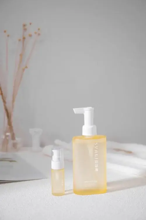
A texture photograph should explain consistency rather than merely look decorative. A cream spread, a small amount of gel or a drop of serum can help communicate what the product physically looks like. Use the actual formula, and take the photograph while its appearance is representative.
Think about the surface under the sample. A glossy tile can make a thin liquid look thicker through reflection. A dark background may exaggerate the colour of a translucent formula. Choose the surface intentionally and compare the photograph with the material in front of you.
Keep the amount shown plausible. An enormous swirl can create the impression of a rich cream when the actual product is a light lotion. Avoid changing the colour or opacity for aesthetic reasons. If the formula separates or dries differently over time, plan the capture so the image does not misrepresent the normal product.
Use ingredient props carefully
A leaf, fruit or flower beside a bottle is not neutral decoration. A shopper may read it as information about the formula. Before using a botanical prop, confirm that it makes sense for the specific product and approved messaging.
Even when the ingredient is present, avoid letting the scene imply a concentration, origin or benefit that has not been established. You can create a convincing natural setting without making an ingredient the hero. A simple surface, directional light and restrained palette can carry the design.
For Amazon publication, verify the current category and content requirements for your product and marketplace. This guide focuses on visual planning rather than deciding which cosmetic or health claims are permitted. Keep that review with the person responsible for the product information.
Build a routine scene around a real action
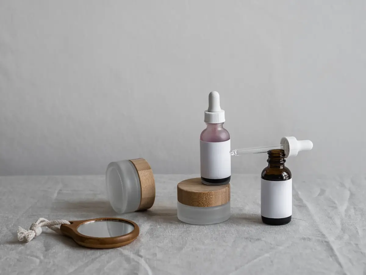
Choose an action the product is actually designed for: opening a cap, dispensing the product or placing it beside other routine essentials. Check the instructions before staging the use. A photograph that shows a convenient but incorrect method can confuse customers.
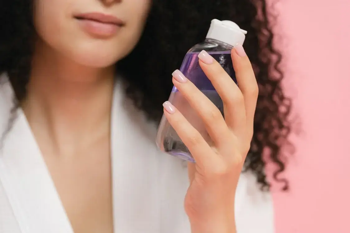
Hands can communicate scale, but the grip needs to look natural. Keep the label visible where practical, and avoid squeezing or tilting the container in a way that makes the closure appear different. If a model is applying the product, the scene should reflect the actual directions and approved use.
Do not use a stock model photograph as evidence of a customer's results. In this article, the Pexels images illustrate composition and context. A brand's live listing needs imagery appropriate to its own product, permissions and claims.
A sample image plan for a fictional moisturiser
The following is a creative planning example, not a tested formula or a real ListingBrain case study.
| Image | Main purpose | Keep visible |
|---|---|---|
| Clean product view | Identify the exact item | Front label, cap and container shape |
| Container and carton | Explain the packaged offer | Correct quantity and packaging version |
| Closure detail | Show dispensing and handling | Actual pump, lid or dropper mechanism |
| Texture view | Explain physical consistency | Real colour and representative amount |
| Routine scene | Show where and how it is used | Correct action and believable scale |
| Supporting facts | Explain approved product details | Verified wording and readable hierarchy |
You may need fewer or different images. A refill pouch, for example, has different practical questions from a glass serum bottle. The point is to make the set useful, rather than to fill a fixed number of slots with similar compositions.
Keep AI-assisted visuals anchored to the sample
Supply a clean reference photograph and the packaging fact sheet before generating supporting scenes. Make a list of details that cannot change: label, cap, container silhouette, formula colour and quantity. Review those details separately from the overall design.
If an output looks attractive but invents a wider pump, cleaner label or different bottle, it needs correction or replacement. Small packaging changes can be easy to overlook when the lighting looks polished. Compare the reference and result at the same size, not on separate screens at different scales.
ListingBrain can help develop supporting product visuals from your reference and supplied facts. Keep final approval with someone who can compare every output to the actual item. The AI accuracy workflow provides a useful starting point for that review.
A convincing skincare image set gives the shopper fewer things to guess. The styling should make the real product easier to understand, while the packaging, texture and use remain honest from one image to the next.
Editorial photographs are credited beside each image. They illustrate the topic and do not represent ListingBrain customer results or an endorsement by a depicted person.