

In this guide
- Write an inventory before drawing a layout
- Make the main arrangement countable
- Separate a multipack from a mixed kit
- Label components where a supporting layout permits it
- Keep props from turning into implied bonuses
- Explain size without making every piece compete
- Photograph the unpacking sequence once
- Worked example: a three-part desk kit
- Review generated visuals for accidental multiplication
A bundle photograph is a counting problem before it is a styling problem. A shopper should be able to tell which products arrive, how many of each are included and whether the visible accessories belong to the offer. When that information is ambiguous, a beautiful arrangement can create the wrong expectation faster than a plain one.
This guide concerns visual presentation. It does not establish whether a proposed bundle is permitted, how it must be registered or which account rules apply. Resolve those questions through the current Amazon guidance for your offer first. Then build the photographs around the confirmed product configuration rather than designing an offer that does not yet exist.
Write an inventory before drawing a layout
Create a component list from the actual packed order. Include the product name, quantity, colour, size and any supplied accessory. Distinguish the total number of items from the number of distinct components. A kit with two cloths, one brush and one case contains four pieces but only three component types. Both descriptions should be understandable and consistent.
Do the same check for every variation. If one option includes a storage case and another does not, a shared photograph can become misleading. Keep the approved component list alongside the images and use it as the final review reference. The strongest contents image is only as accurate as the inventory used to produce it.
Make the main arrangement countable
Lay the included components out so their edges remain distinguishable. Heavy overlap can make two items look like one, while reflections or repeated packaging can make one item look like two. Start with a simple arrangement on a clean surface, then improve spacing without compromising the count. Rotate a component when its useful shape is otherwise hidden.
Check the applicable main-image treatment in Amazon's Product image guide and the relevant category guidance. Do not assume that a persuasive supporting graphic is suitable as a main image. Keep your clean product arrangement and your labeled contents layout as separate assets with distinct purposes.
Separate a multipack from a mixed kit
A multipack usually asks the shopper to understand repetition: several units of the same item. A mixed kit asks them to understand a combination: different pieces serving related jobs. Their supporting images should reflect that difference. Repeated units benefit from a clear count and exact unit size. Mixed kits benefit from named components and an explanation of how the pieces relate.
Avoid letting a large outer box stand in for the contents. A box may look substantial while telling the shopper very little about the offer. Conversely, a spread-out arrangement can make a compact kit appear much larger than its packed footprint. Show both configurations where they genuinely help, with verified dimensions in the appropriate image.
Label components where a supporting layout permits it
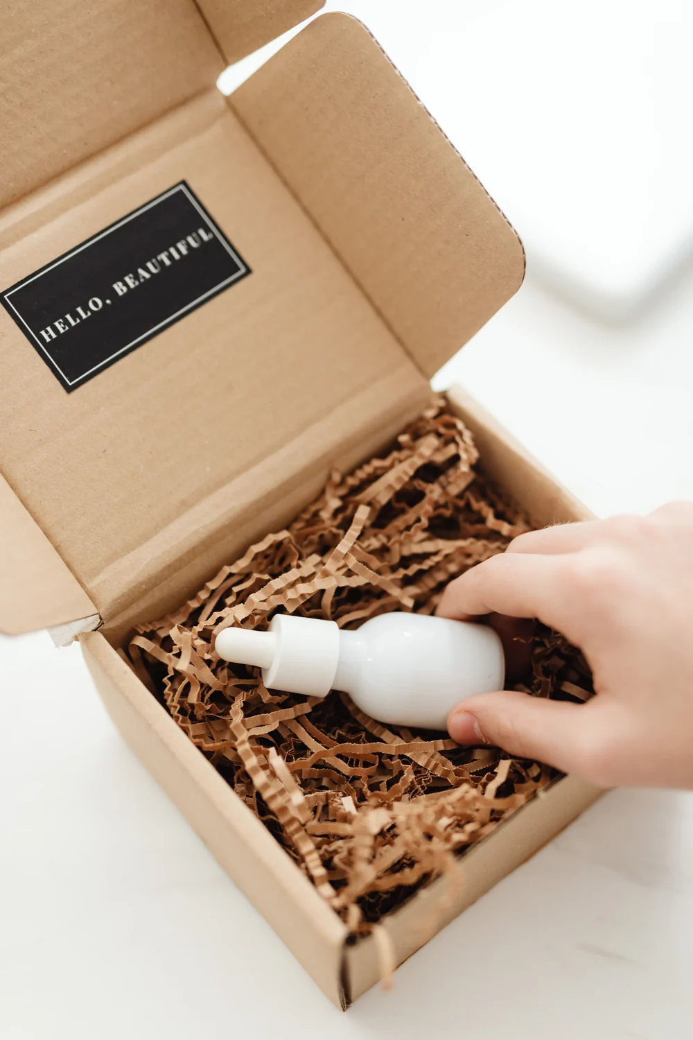
Use short names that match the product page. Position each label close to the relevant item and avoid long crossing leader lines. If quantities differ, make those differences visible. The label brush should not visually apply to an adjacent pair of cloths. At phone size, the arrangement must still make sense even before the smallest copy is readable.
A useful hierarchy is a concise contents headline, then component names and counts. Put secondary technical details in a separate image when they require more room. The what-is-included image guide provides a closer look at component layout and prop ambiguity. Use it to check whether your content is easy to read rather than merely complete.
Keep props from turning into implied bonuses
A gift ribbon, stand, mixing bowl or charging adapter may make a scene attractive, but shoppers can reasonably assume it arrives with the order. Use only necessary contextual props, keep them secondary and provide an unmistakable contents view elsewhere. If a prop creates more confusion than the scene resolves, remove it rather than trying to rescue the composition with tiny text.
Be particularly careful with a component that resembles a natural companion to the product. A cable beside an electronic accessory is more likely to look included than a plant in the background. A spoon inside a food preparation kit can carry the same ambiguity. Review the image as someone who does not already know the component list.
Explain size without making every piece compete
A bundle may need more than one type of dimension. The storage case has an overall footprint; a tool has a working length; a consumable has a stated quantity. Do not squeeze unrelated measurements into a single crowded diagram. Group them according to the decision the shopper is trying to make.
For a compact cleaning set, one image might show the case dimensions and another the brush head detail. A labeled flat lay can communicate counts without measurement arrows at all. Use the approved specifications and a clear method, as described in our product dimension image guide. Never use layout scaling as a substitute for measured information.
Photograph the unpacking sequence once
A short internal unpacking sequence is useful even if it never becomes a public asset. Photograph the closed package, the opened package and the full contents on the table. Compare that sequence with the proposed gallery. It exposes missing accessories, duplicate counts and changes introduced during styling.
Keep these reference photographs connected to the production batch or approved sample. If the packaging supplier later changes an insert or accessory, the marketing team needs to know whether the public gallery requires an update. A neat filing structure prevents an old kit photograph from being reused simply because it is the easiest one to find.
Worked example: a three-part desk kit
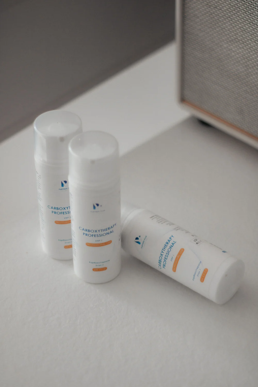
Suppose the offer contains one notebook, two pens and one pouch. Begin with a component list that says exactly that, rather than calling it a three-piece kit. Create a product-first arrangement where both pens are visible. Make a supporting contents image with the three component types labeled and their quantities beside them. Show the pouch's usable size separately if fit matters.
A lifestyle scene can then show the notebook and one pen in use, provided the gallery already establishes the complete contents. It does not have to display every part in every frame. What matters is that the whole listing remains consistent and no scene introduces an extra accessory that changes the perceived offer.
Review generated visuals for accidental multiplication
If you use ListingBrain for supporting graphics, inspect repeated objects carefully. AI can duplicate a cap, remove a small component or turn a reflected item into another physical unit. Count every component in the generated image against the inventory, then check colours, labels and proportions.
Finally, ask someone unfamiliar with the kit to describe what they think arrives. Give them the gallery without explaining it first. If their count differs from the actual packed order, revise the image that caused the misunderstanding. A clear bundle gallery makes the offer easy to understand before the customer adds it to their cart.
Editorial photographs are credited beside each image. They illustrate the topic and do not represent ListingBrain customer results or an endorsement by a depicted person.