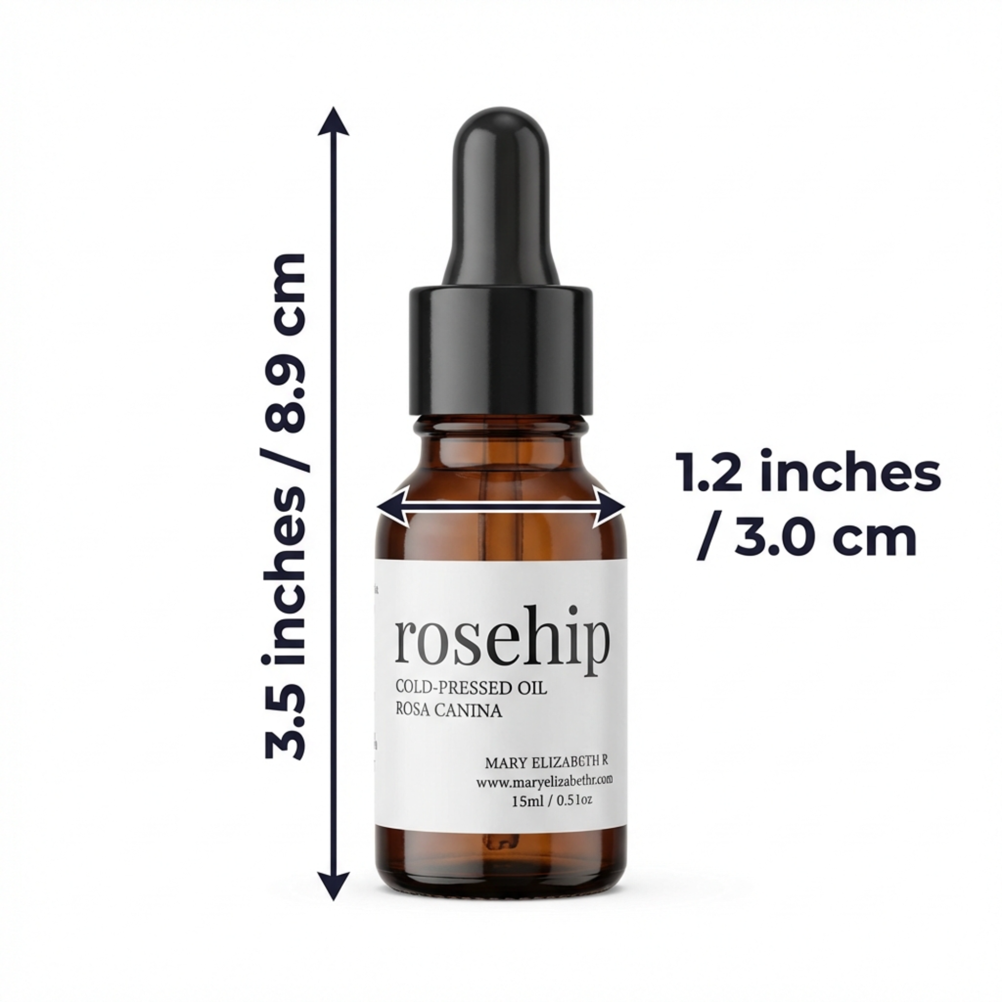
The practical point
The best infographic image is not the one with the most facts; it is the one a mobile shopper can understand in seconds.
Design for the moment a shopper sees the image at a small size on a phone. A headline should be readable without zooming, the product should remain visually dominant and supporting icons should clarify rather than decorate.
How to use this on a real SKU
- Choose one claim or feature per graphic.
- Use a headline that names the buying reason.
- Support it with a close-up, diagram or clear proof point.
What experienced sellers review before publishing
Large type, one message, high contrast, real product evidence, no crowded icon grids and no vague superlatives.
Avoid the temptation to turn a listing image into a specification sheet. If an important fact requires a paragraph or a dense table, move it to a place where a buyer can actually read it comfortably.
Keep every asset tied to the product that will actually ship. Check small-screen readability, the current variation, packaging and included components. If a generated image is not strong enough, regenerate that slot and compare the new version with the earlier result.
A stronger image system, not isolated graphics
| Asset | Buyer question | Best use |
|---|---|---|
| Main or product-first image | What is this? | Immediate recognition and confidence |
| Benefit or feature image | Why should I choose it? | One specific, supportable buying reason |
| A+ Content module | How does it fit my needs? | Deeper feature, use-case or brand context |
Build the visual set around your actual product
ListingBrain turns a product reference and the facts that matter into gallery images and A+ Content you can review and regenerate individually.
Create your listing